(not pictured)
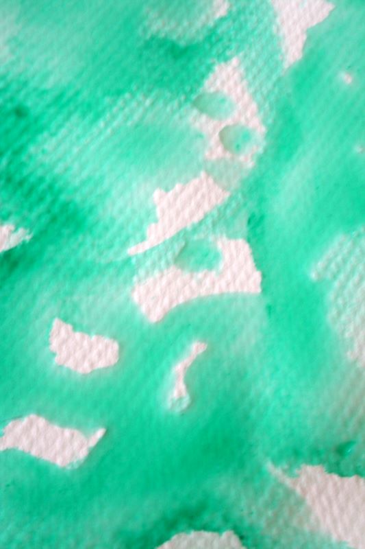
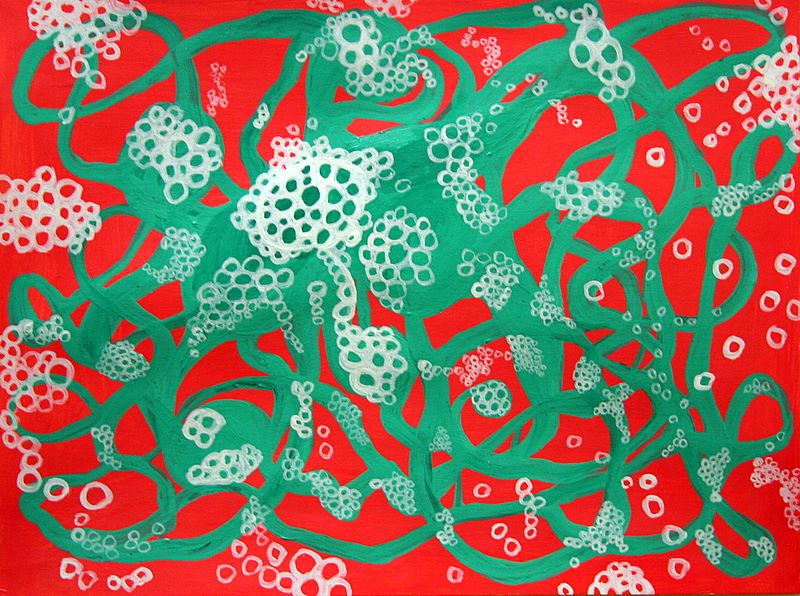
Today I worked on the green and red piece from day 22, but neglected to photograph my progress.
Basically I began introducing the green into larger areas of the red, breaking some of it up and giving a more fragmented feel to the red lines.
(This entry was back-posted on 2/10/07).
Wednesday, January 31, 2007
Tuesday, January 30, 2007
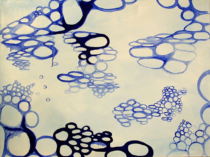
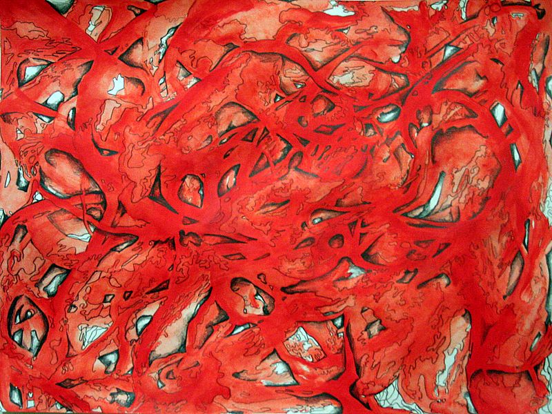
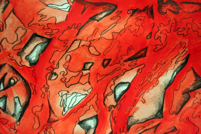
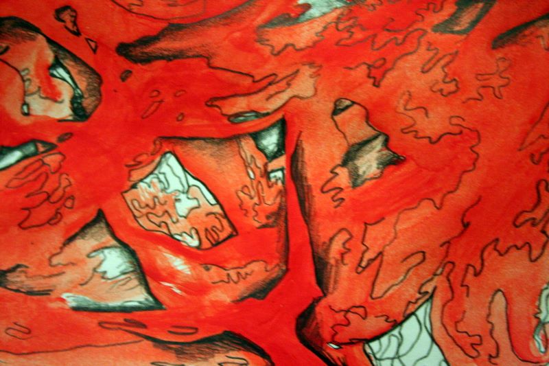
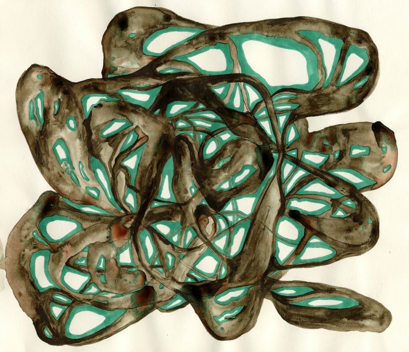
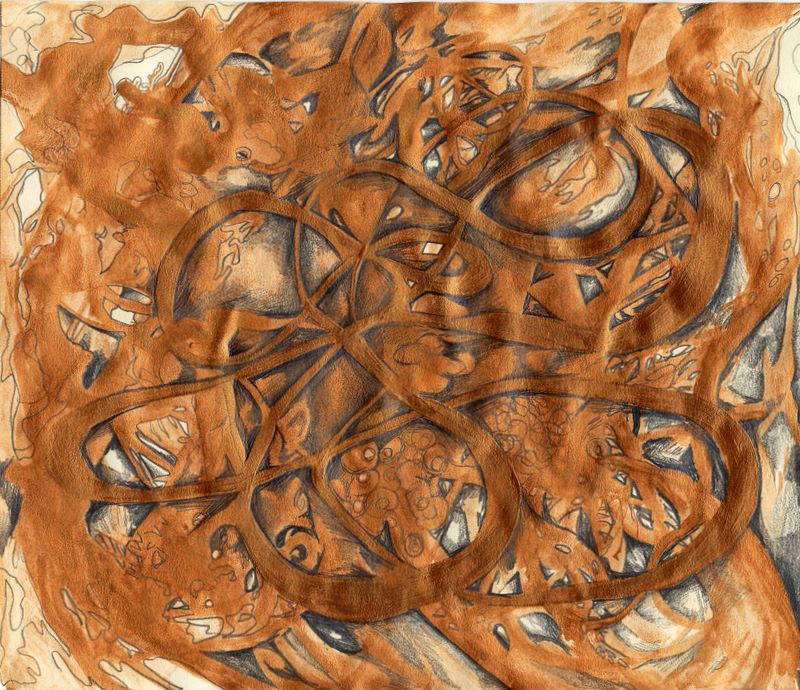
Day Twenty-Five

5"x7", ink on paper
During a lecture I started this meandering line drawing and something about its meandering complexity really spoke to me.
I usually only write with this type of pen (Uniball Micro), so it follows that I would enjoy drawing with it as well. I think I should do something larger with it.
(This entry was back-posted on 2/10/07).
Monday, January 29, 2007
Day Twenty-Four
Today I spent my painting time writing a preliminary statement for my thesis class. Though this is a very rough first stab, it proved to be a worthwhile exercise in focusing my thoughts and recognizing the central ideas around which my work forms. Though this whole website would seem evidence to the contrary, I'm very dodgy about writing in any kind of first person tense (when I have to hand it in) and this statement perhaps suffers a bit of over-cautiousness in adherence to words.
Nevertheless, it may put some things in context:
(I really would love feedback about these concepts, even if you think it's complete nonsense - don't be shy - chime in.)
Nevertheless, it may put some things in context:
Buckminster Fuller is often quoted as saying, “When I am working on a problem I never think about beauty. I only think about how to solve the problem. But when I have finished, if the solution is not beautiful, I know it is wrong.”
These paintings look to the sprawling, tangled organic growth of the natural world and reduce it to linear elements, modular forms, and rhythms. By repeating one aspect of the vast complexity of the perceived world, one can gain access to patterns and systems previously hidden in detail.
Acts of meditation seek to discover simplicity and clarity amidst a super-saturation of information and experience. Mathematically, living in this world is akin to a profusion of outlying data points when one is seeking a smooth trajectory curve. The density of influencing factors is overwhelming, confusing, and frustrating, and one could regard cultural angst as the inability to recognize patterns and meaning, or the failure to derive pleasure from them. A method of abstraction which hones in on one aspect of movement, development, or perception provides a focus of organization, around which data sets demonstrate new meanings and altered trajectories, more beautiful for their idiosyncrasies.
The geometry is simple, using familiar curves and archetypal forms such as circles and intertwining lines to form branching compositions reminiscent of both the microscopic interior and macroscopic exterior worlds. By allowing a system to propagate organically as a collection of objects or ideas, these paintings become living things themselves, exemplifying the phenomenological experience of set theory. The overarching principles of organization which take over become both a definition and extrapolation of beauty.
If spirituality is considered as a problem-solving expedition, one can say that finding order and understanding one’s place in the greater whole is solving a significant aspect of being. The harmonious connection of oneself to nature and the systems and cycles of life has long stood as a powerful driving psychological force. An intense clarity emerges in this painting process when undulating, intertwining masses of people, objects, time, geology, and forms of energy are abridged and condensed into a small shift on an elegant curve.
Science being merely a system of aesthetic preferences, order is not the only measure of truth and beauty. The methodology of the scientific method, however, provides a starting-off point for other kinds of exploration. By controlling the data set involved, particularly by limiting the colors within mathematical relationships or restricting the relation of objects to scale, the painting process mimics the initial steps of variable controls. In these limitations and further reductive measures, one can translate – and in some ways transcend – what exists in the world, becoming able to view them in an elemental way.
Many artists have dealt with organization and modular organic forms, notably Eva Hesse, Brice Marden, Terry Winters, Alexander Ross, and Matthew Ritchie. This work is strongly influenced by eccentric abstraction and the linear compositions of countless contemporary painters. It is also imbued with a sense of 1930s and 40s American modernists, including Arthur Dove and Georgia O’Keeffe, following a method of abstraction based in looking as closely as possible and focusing one’s concentration to the simplest moments within the greater whole.
(I really would love feedback about these concepts, even if you think it's complete nonsense - don't be shy - chime in.)
Sunday, January 28, 2007
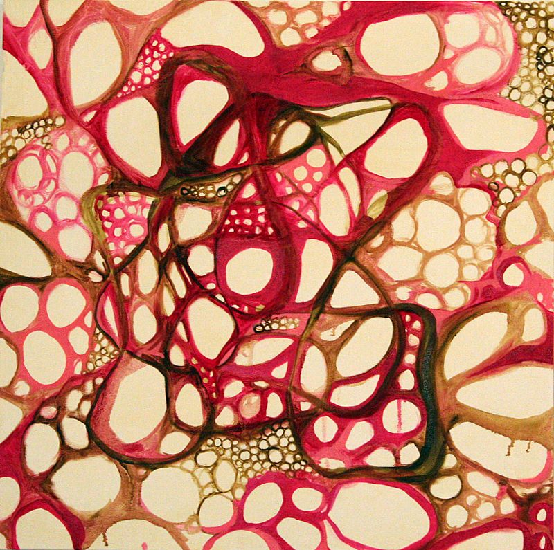
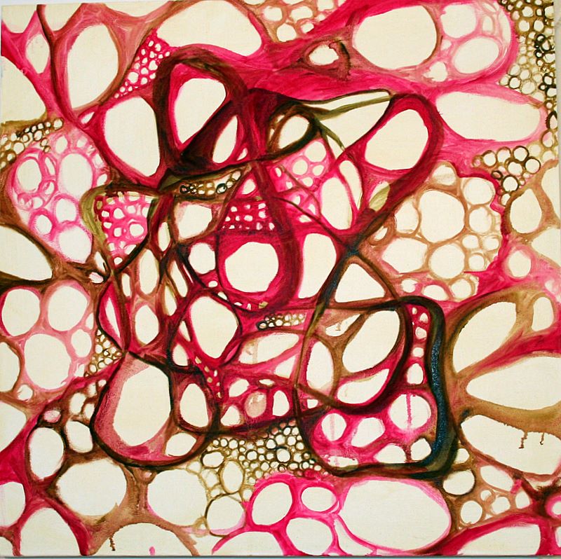
Day Twenty-Three
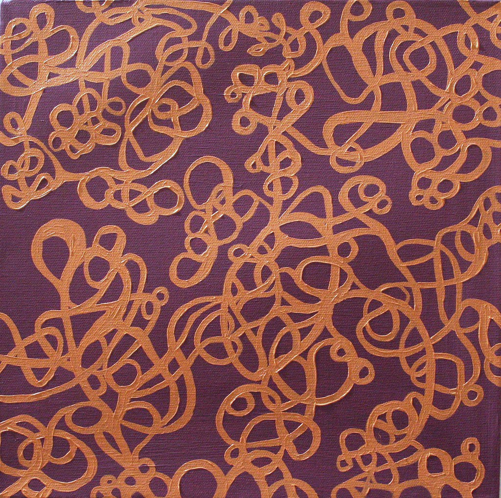
12"x12", oil on canvas
This is a rather small piece, with wide stretcher bars. When I was preparing the surface with the purple, I painted the canvas edges purple as well, so I regard the entire thing more as a box or an object than a surface. I created this meandering line composition with a peachy tan color made largely from burnt sienna and titanium white. At present, it is just on the front of the canvas, but I think I will most likely extend it over the edges to reinforce the three-dimensionality of this painting.
I learned an interesting thing about the color purple this past week in my Materials, Techniques & Conservation class: it is the only secondary color which cannot be represented by a single wavelength of light (only a mixture of red and violet). The color wheel is kind of an artificial relationship to light anyway, but this stood out as a unique property to me. Additionally, purple is one of three words in the English language which have no true rhyme (oddly perhaps, the others are orange and silver). All these things have made purple seem the most intriguing and bizarre color to me, and I like the way it holds its ground in this piece.
Saturday, January 27, 2007
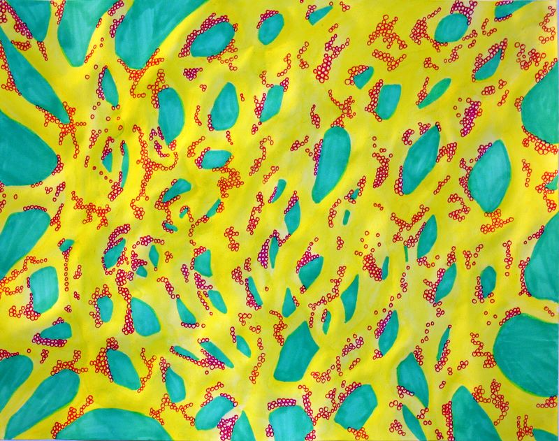
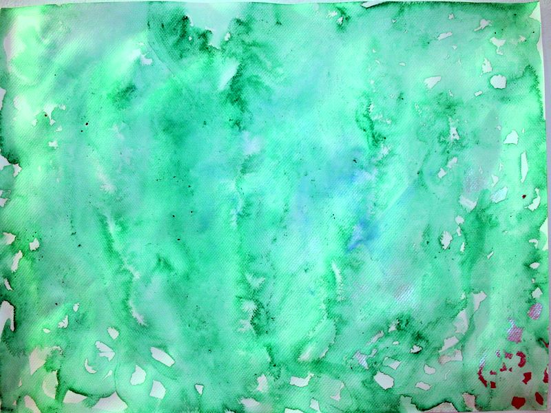
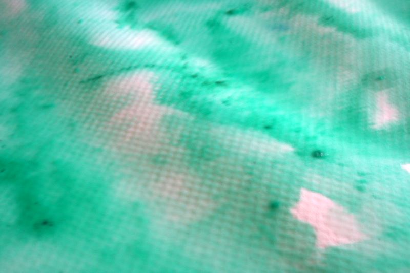
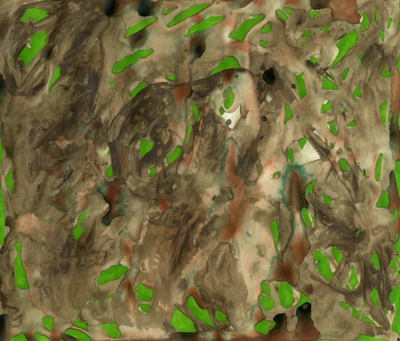
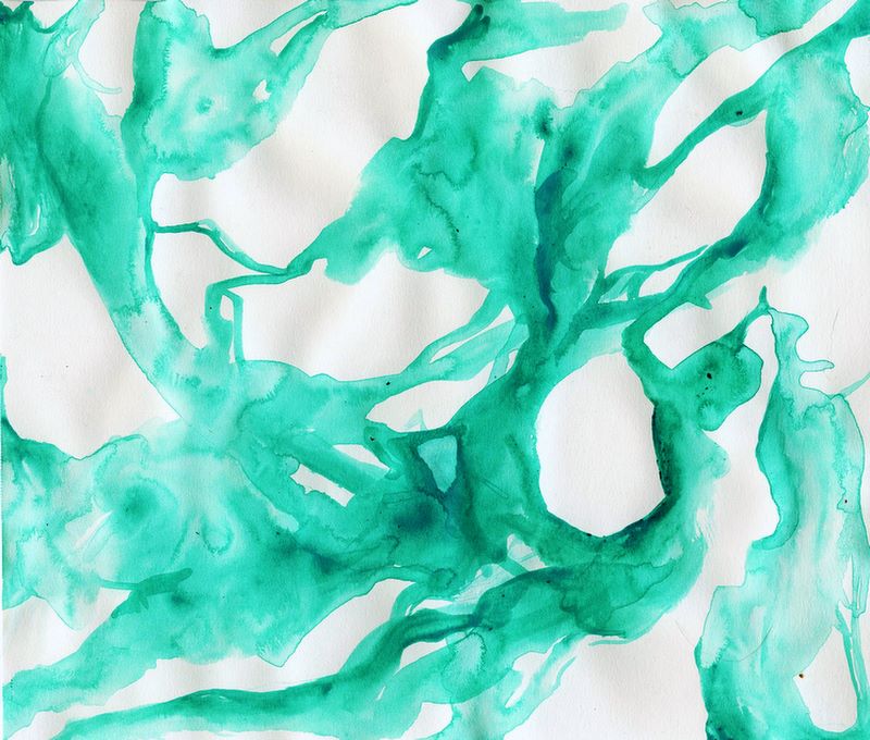
Day Twenty-Two
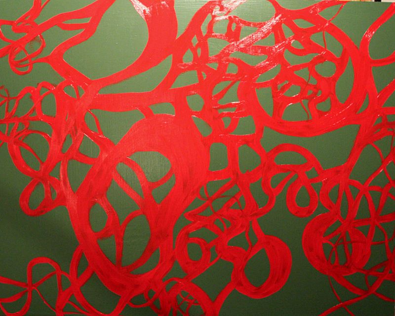
24"x30", latex & oil on panel - in progress
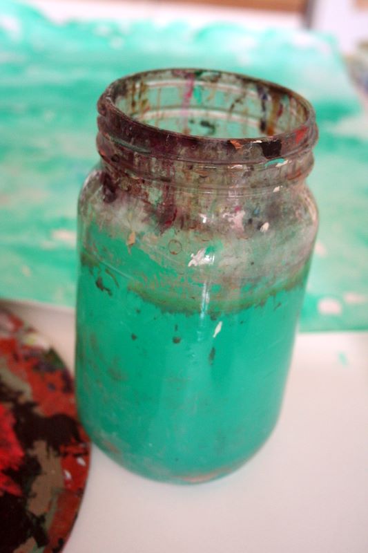
I bought some latex enamel in this delicious green shade and coated a masonite panel with it. It dried fairly quickly, which enabled me to get right to it with a juicy mixture of cadmium red, transparent white, and a lot of bleached linseed oil. At this phase, the red areas are very streaky, but I will work them up to a uniform surface. Admittedly, I want them to be more volumetric and illusionistic, but this is a path I have to avoid for the time being.
Last night I had a dream that I hung a bunch of ropes around my studio, similar to Eva Hesse's rope piece. I spray-painted them silver or gold, and it was all an exercise in understanding how lines move in space and define it. Generally-speaking, I think it's a good idea to listen to one's dreams, so when I get my hands on some cord or wire, I'll have to give it a try and see what happens.
Friday, January 26, 2007
Day Twenty-One
16"x20" oil on canvas
This is the painting begun on day 18. Obviously I've made it with crisper edges and more even tone throughout flat areas of color. I'm not sure if I'm completely happy with that change, as there was something compelling in the initial unevenness, particularly in the washy background.
At this point I'm calling this piece finished, though I'm seriously considering going back in with bright red lines which form another intertwining system. I'll do some studies and see how that works.
Thursday, January 25, 2007
Day Twenty
24"x24", oil on canvas - in progress
I worked briefly on this piece started on day 13. Mostly I prepared canvases and dallied around with other things. The changes in this piece are so slight they may be imperceptible, but I concentrated on pinks, in all kinds of shades. I decided I'm going to go back in with specifically-mixed tones of pink, brown, green, and tan to make the areas of color hard-edged and clean. I'll also have to clean up the titanium buff to make it a pure, chalky surface again.
Wednesday, January 24, 2007
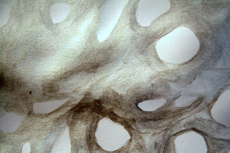
Day Nineteen
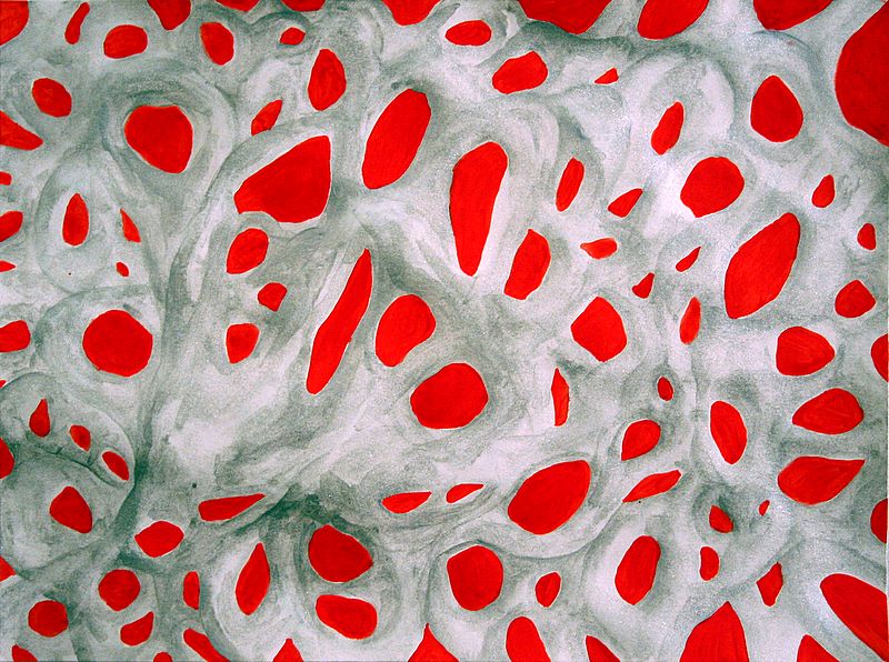
9"x12" acrylic on paper / detail view
I'm rather disappointed with myself on this one. I wanted a quick finish on something, and since I spent most of my studio time preparing canvases with solid colors, I hastily chose cadmium red to fill in the white spaces against the silver in the piece I'd started on day 15.
I had thought it would have an interesting matte/metallic contrast, but the intensity and uneven application of the red seem to overpower the subtleties in the silver which I'd enjoyed so much. I'll look at it again tomorrow and maybe try to revert to white or some other color, but it has lost the delicacy and immediacy of an exposed paper surface. Ah well.
A Note
I have not become some kind of artistic delinquent despite appearances - I have kept up with this project, but in the process of wiping my computer's hard drive, reinstalling Windows, etc etc, I've choked up on posting photos and such.
I'll back-post from day twelve to the present later this evening and hope to resume a more timely schedule soon.
I'll back-post from day twelve to the present later this evening and hope to resume a more timely schedule soon.
Tuesday, January 23, 2007
Day Eighteen (backposted)
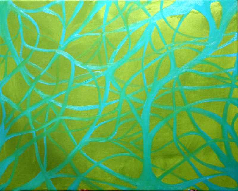
16"x20", oil on canvas - in progress
I wish I'd had the presence of mind to hold off on the turquoise lines until the ground was dry. I started with tinting the canvas in a green mixed from cadmium lemon and French ultramarine, without any white. I mixed a handful of blues and teals into the other color, which appeared more like a bright light blue on my palette. I'm fascinated by the way it seems to glow against the green, but unfortunately as I applied it, it mixed in with that green and changed a lot.
I've put this painting aside to dry a bit so that I can go back in with more opaque layers of the turquoise. I'm not sure if I will make the green more opaque - in some ways I quite like the lightness and uneven surface of the tinting, but I also realize that having such an airy background forces the space in a limited way which could be avoided with equal coverages. I'll have to see how it looks in a few days.
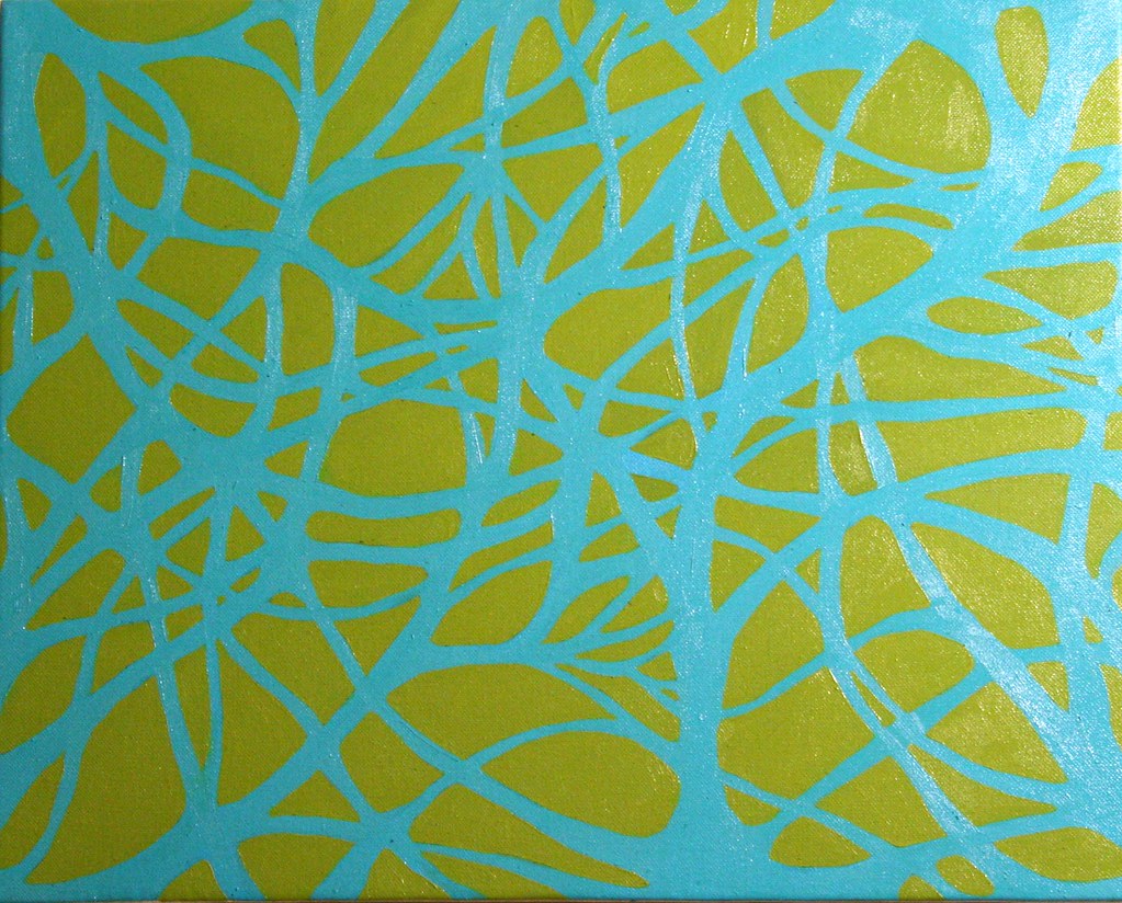
Monday, January 22, 2007
Day Seventeen (backposted)
30"x40", oil on canvas - in progress
I started this painting thinking about blues. My boyfriend's mother had given me a wonderful tube of cerulean paint at Christmas, and I've been studying pigments in one of my art history classes. I used a rag to tint the canvas with a wash of cerulean, then pulled the French ultramarine to begin some kind of study in blue.
This canvas size is about the largest I'm comfortable working with right now, as it relates and corresponds to the body, allows for movement from the shoulder, and feels both expansive and compact to me.
I need to work out the appropriateness of scale in my markings such that the circles transforming into ellipses and mesh-like grids correlate with the canvas size and shape better.
I'm also a bit bothered by the way I've handled the French ultramarine, as it's close to its mass tone in the lower left and darker portions and losing the luminosity and brilliance for which I initially chose it.
Sunday, January 21, 2007
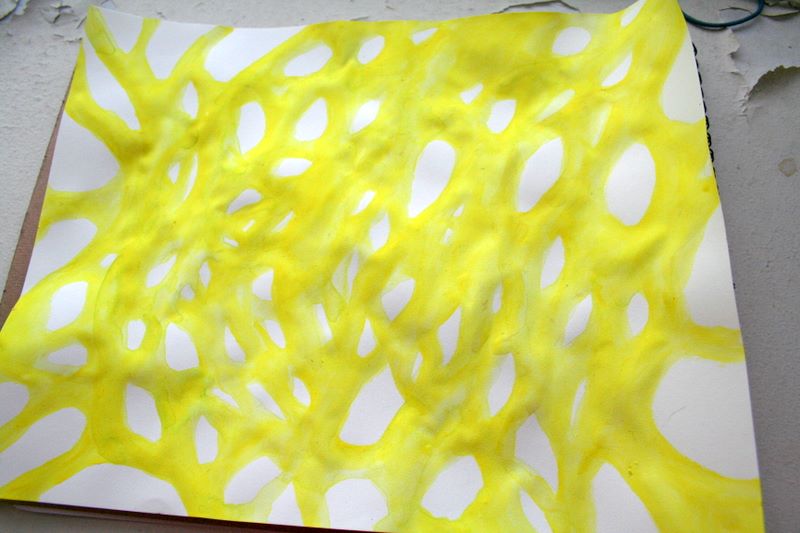
Day Sixteen (backposted)
9"x12", acrylic & permanent marker on paper
I returned to the yellow piece from day 11 and impulsively filled the spaces with turquoise magic marker. Compared with the original, I thought it became rather empty and dead.
I got into a lengthy discussion about this piece while I was working on it, and I went in with a thin raspberry marker, making the tiny circles as I attempted to defend it for having any kind of artistic value whatsoever. (Not a pleasant experience).
In the end, it reminds me of blood cells in capillaries or something vaguely organic, but it fails to take on the springing-forth quality of multitudes I'd imagined when I started, and I think the energy falls a little flat. When I look back at the progress shot, I much prefer the yellow by itself, which I think much more clearly conveys the things I was going for.
Saturday, January 20, 2007
Day Fifteen (backposted)
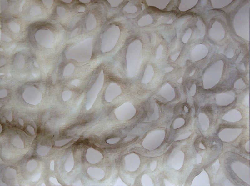
9"x12" metallic acrylic on paper - in progress / detail view
Entranced with the shiny metallic silver paint I'd used the day before, I started a piece on very smooth Bristol, again letting forms emerge from modular elements.
I really loved the luminosity of such a thin layer over white, and I put the piece aside to consider how I could enhance or showcase that effect.
Friday, January 19, 2007
Day Fourteen (backposted)
18"x24" watercolor & acrylic on paper - in progress
Since I'd been using acrylic essentially as a watercolor, I thought it might work to saturate the surface of the paper and actually try some watercoloring. I had extremely limited patience, however, as I was using gridded drawing paper susceptible to pilling (so it more closely resembled painting on a paper towel) and I was displeased with the tinting strength of the sky blue paint I was using.
Some genuinely beautiful things were happening with the green, but too quickly they faded into the wash or absorbed into the paper, so the end result at this point really isn't much to look at.
I'd started in with metallic silver in the lower right corner, but quickly decided this was out of place, so I'll have to think of a resolution to that if I ever finish this piece.
 At this point, my favorite thing about this painting is the color it turned my water. Maybe sometimes that's all there is.
Thursday, January 18, 2007
Day Thirteen (backposted)
24"x24" oil on canvas - in progress
I started this piece by tinting the ground with titanium buff - a paint I received among my Christmas gifts - and that began suggesting muted colors to me. I turned to one of my favorite olive greens and originally just made an intertwining linear shape (remains of which are evident in the central portion) for the first pass.
When I came back to it, I'd been thinking about tropical plants from Costa Rica which grow with pink and green in the same leaves, and I was considering that color combination when I decided to intervene with a rosy color. I liked the brown that they produced in combination as well... though I haven't yet decided how I'd like the colors to end up in this piece.
As I've said, I'm becoming increasingly interested in modular elements coming together and the patterns that emerge within repetitive systems. Here I thought about circles and the way that the paint would modulate between outlining the circle or becoming the circle's edge. I'll have to find a way to make these ideas more apparent in the finished work so they don't just come off as effervescent and decorative.
Wednesday, January 17, 2007
Day Twelve (backposted)
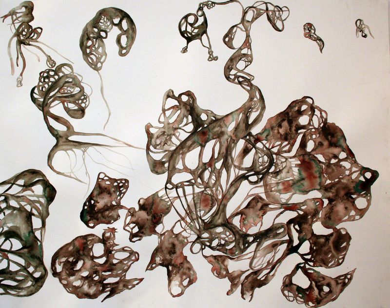
24"x30" (?), acrylic on paper
This is the larger piece which I began on day 7 and continued to work on in passing.
I was especially interested in the ways the paint separated from a solid brown mixture into its constituents of phthalo green and cadmium red, which I suppose is to do with chemical properties of the two emulsions.
Personally, I found it rather poetic to use water in such a way, a diluent with the capability of separating a presumably stable mixture by immersing and extending it beyond the adhesive properties of acrylic resins. In my head, it was a bit of a conceptual metaphor, which I think also influenced some of the forms, which began to take on a primordial, narrative quality for me.
I think there is something in this type of work which is essential to who I am as a painter, but the confines of this semester and my thesis project may prevent me from thoroughly exploring it imminently. I'll probably keep up with smaller works though and see where it goes.
Tuesday, January 16, 2007
Day Eleven (backposted)
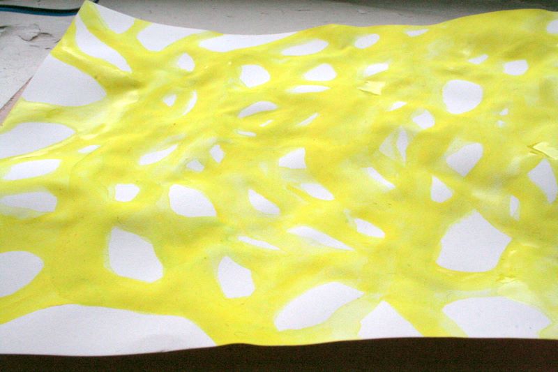
9"x12" acrylic on paper - in progress
I started this piece with a consummate need to use Hansa yellow, and though it isn't terribly evident, I went over the shapes as they developed with several layers of it. I've been concentrating lately on modular forms, watching patterns of growth which emerge in repetition.
Here I am using acrylic as though it were watercolor in some ways, though obviously the paper isn't suited to it. In the oblique view at left, the ridges and curved grooves on the surface of the paper become evident, and in many ways I was as interested in those as any final product. I left the piece to settle for a few days while I considered what more I'd like to do with it.
Monday, January 15, 2007
Days Nine & Ten
I spent my art time reorganizing my studio and doing nonsensical things around the apartment. I probably could have thrown together some small pieces, but I didn't.
On one hand, it feels good to have a much better set-up in the studio... on the other, I'm annoyed at myself for not taking advantage of it and getting some work done.
My semester starts tomorrow, so I'll have to get back into the everyday thing then.
On one hand, it feels good to have a much better set-up in the studio... on the other, I'm annoyed at myself for not taking advantage of it and getting some work done.
My semester starts tomorrow, so I'll have to get back into the everyday thing then.
Saturday, January 13, 2007
Day Eight
9"x12", acrylic & graphite on paper
detail views
I haven't gotten back to the larger piece I've been working on, let alone the studio stuff I wanted to do today... bleh.
I'm not thrilled with this piece, but it was one that was nearly finished, so I got back into it for the sake of doing something today. The graphite kept rubbing off on my wrist, which was driving me genuinely insane, and I think that accounts for my initial loss of enthusiasm about this piece.
I included the detail views because I think there are interesting complexities and moments in the drawing which become lost in the overall work. I have to work on my relationship of scale of detail to the whole.
Friday, January 12, 2007
Day Seven
8"x10", acrylic & permanent marker on paper
8"x10", acrylic & permanent marker on paper
8"x10", acrylic & permanent marker on paper
9"x12", acrylic on paper
As I'd mentioned yesterday, I had a lot of this grayish brown color made from phthalo green (blue shade), cadmium red light, ivory black, and white. I noticed as I was working with it that the pigments would separate if I let water sit on the mixture for a while, making green and red pools and suchlike - it was a very strange thing, considering acrylics usually form a rather stable and definitive mixture.
I played around with a bunch of watery distributions, then went back in with colored Sharpies to define the spaces of the background plane. In the first piece, I think the red works to provide tension between the forms and the plane, as well as demonstrate awareness of the flatness of the surface and correct any misapprehensions of illusionism... in the green and turquoise accents, I don't think this effect comes through at all really, and apart from some nuances of form, I think they're much lesser pieces.
Of these pieces, the fourth is probably my favorite, as I think it goes beyond a simple design to start suggesting forms existing in space (yes, I know, I just said I was trying to deny that), but in an abstract, idiosyncratic way. I felt this one had enough color separation that inserting a backdrop would disrupt its inner continuity, and since I actually liked the way it existed on the page, I kept it as is.
I also started working on a much larger watery piece at the suggestion of my boyfriend, who plunked a stack of delicious paper in front of me and said "Come on, you can do something more than these." We talked about the sense of grandness when a person encounters a large piece with strong presence, and though I'm always making arguments for smaller work (I guess I'm rebelling against this bigger-is-better mentality dominating the art world), I have to agree: it's one thing to discover tiny and intricate worlds in a painting in an individual experience, and it's quite another to stand before something edging on epic and feel actual awe and intensity.
My semester starts next week, so this weekend in addition to reorganizing my studio space, I want to complete some larger, more developed pieces. I hope it goes well.
Thursday, January 11, 2007
Day Six
9"x12", acrylic on canvas board
I didn't end up going to my studio today, though I spent time cleaning my apartment and getting the rest of my life in slightly better order.
The brown in this photo is more of a gray or taupe, but it was very difficult to get the color accurate... still have to work on that.
I have a lot of that color leftover, and it's so strange to me, but one of my largest impulses to start new work sometimes is not wanting to waste paint that I've mixed - I wish acrylic could be kept longer, but then again it's good for anything to get me going.
Wednesday, January 10, 2007
Day Five
9"x12", acrylic on paper
8"x10", acrylic and graphite on paper
8"x10", acrylic and graphite on paper
8"x10", acrylic and graphite on paper
I've got a busy pile of pieces going now, including some that are very similar to the last two and some that are completely different. I'm going around and around with these compulsive circles or shapes and the combination of drawing and painting... something I need to work on more formally I think.
There is something sort of disposable and casual about these works, maybe the materials (cheap paper, watery paint, mechanical pencil), maybe my attitude toward them. That throwaway attitude could be really problematic in less than a week when I start my next semester. I think tomorrow has to be an actual studio day, not so much of this at-home leisurely stuff, as much as I'm enjoying it.
Tuesday, January 9, 2007
Day Four
8"x10", acrylic on paper
I'm not feeling well at all today, so it's not surprising that I'm having trouble focusing on painting. This was actually one in a series of paintings which started quite differently - I'm going to keep working on some of the others and see what I come up with. Sometimes I like using acrylic more like watercolors; mostly I just get mesmerized by the way water flows and carries pigments through it.
Monday, January 8, 2007
Day Three
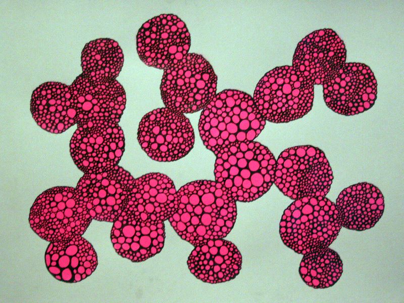
18"x24", acrylic & permanent marker on toned paper
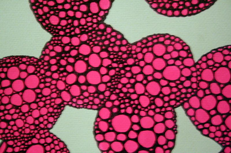
detail view
This piece developed very organically. I looked at a bright pink silicone jar opener I was given around Christmas and thought about the color for a while. I opened a tablet of gray scale paper and pulled out the lightest gray, then I found myself mixing quinacridone red with white to make opaque pinks. I was fascinated with the way the gray shifted to a muted green next to the pink, and I applied several layers in circular shapes, which began to take on a pattern.
Often when I am feeling anxious, I draw hundreds of tiny circles in my sketchbook. They vary in size and begin to form larger shapes, usually resembling molecules. In this painting, I used that method in reverse: creating and outlining small circles on the surface of these pink orbs with a black Sharpie. True to the process, it became a compulsion to finish them all, and I actually completed this work in the wee hours of this morning, having started it rather late last night.
It was very satisfying to see an idea through to its end, even if the finished piece is perhaps too austere or self-evident. Ordinarily, I would probably do a few circles, think to myself "Yeah, I get the idea," and then abandon it. As I worked through the set-up, I found the circles and the way I drew them changing, and the piece took on dimensions I hadn't planned for - the kind of thing you can only really learn by doing it and experiencing it. It feels very good to learn.
This piece was extraordinarily difficult to photograph. The acrylic has a lovely shiny texture, which the Sharpie also takes on, and they develop this strange figure-ground relationship akin to glossy stickers affixed to the textured paper's surface. Flash obliterated the details, and I was admittedly too lazy to set up a proper lighting situation to capture the effect the way it appears in person. Perhaps this project will help me get over my loathsome relationship with photographing my work.
Sunday, January 7, 2007
Day Two
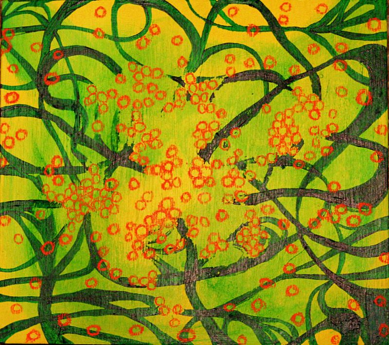
10"x11", acrylic & grease pencil on wood
I have a number of wood panels prepared with gesso and a layer of bright-colored acrylic, in this case the bright yellow (which is a slightly cooler color than in this photo). I started this out as a sort of standard meandering ribbon painting with the phthalo green.
I watered some of it down and used a paper towel to smear it. It picked up parts of the thicker paint, and I decided to just go with it, creating an atmospheric blend over the yellow background. I started envisioning spores and bursts of growth, which in my mind come as orange circles, it seems. The orange is a photo marking grease pencil, which gives a nice smeary line.
I plan to clear-coat this piece to seal in the grease pencil and keep any more acrylic from scraping off.
Saturday, January 6, 2007
Day One
8"x10", graphite and metallic acrylic paint on off-white paper
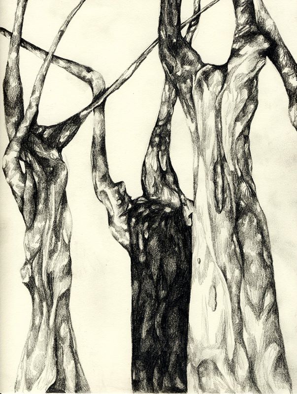
9"x12", graphite on off-white paper
(click images to enlarge)
So, for day one, I've kept it fairly small and simple. The most interesting thing about the bronze piece was the paint itself and the ways the metallic particles moved in and out of the light when I was stirring it and mixing it with water. I wish I could have captured more of that effect and the glistening way it took to the paper. My boyfriend helped me make a small video of the paint being stirred, which I'll perhaps edit and post sometime soon.
The tree drawing was initially based on this photograph, but obviously I didn't stay very close to the details. It was interesting to try drawing even semi-representationally, as I haven't done it in a long time.
Introduction
I am about to enter my fourth semester of grad school, where I am simultaneously pursuing an MFA in Painting and an MS in Art History, Theory & Criticism. Theoretically, this should be the semester in which I complete my MFA thesis and that portion of my degree.
I've been struggling lately with my process, and I think many of my problems come from a lack of discipline. I have given myself the challenge of creating at least one work of art every day, hoping it will inspire and influence my studio practice for the better. As a project, I think the serial production of daily art certainly has its own merits, which I plan to consider as I go.
I really welcome feedback if you are so inclined, as it can only help me improve. Thanks for reading, and enjoy!
Subscribe to:
Posts (Atom)