I can remember the approximate order, though, so bear with me - this will be rather a lot of scrolling.
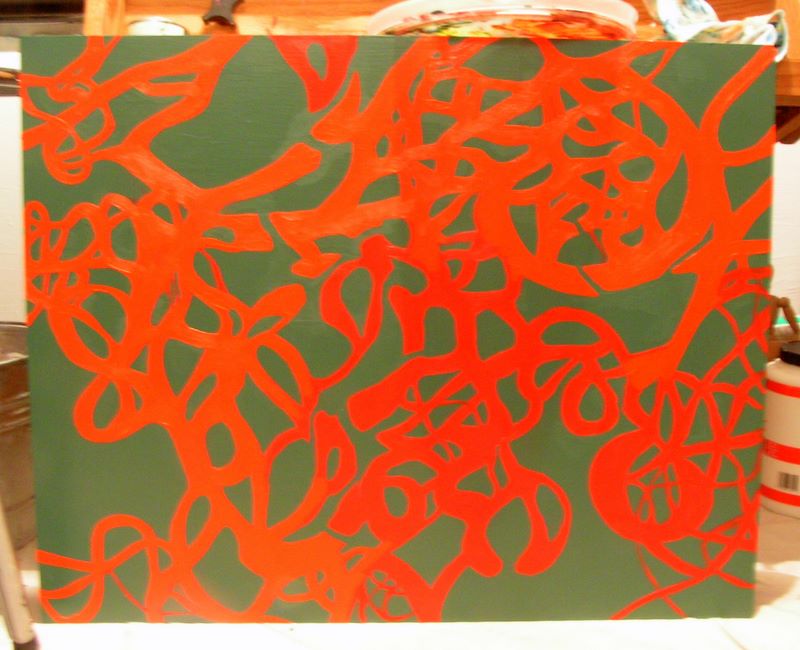
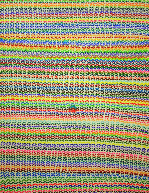
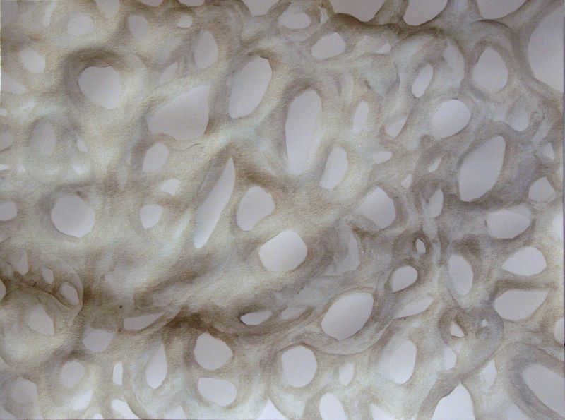
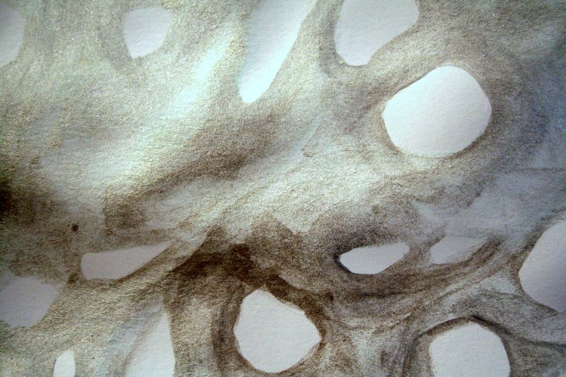
24"x30" oil and latex on Masonite panel - in progress
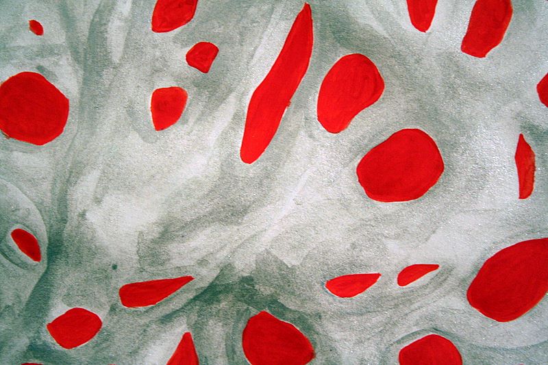
I've updated this piece a little bit - the brighter, more orangey areas are more solid (I have yet to get to the darker red bits), and I worked the green latex back over the surface to break up some of the red areas. Not sure where I want to go with this one, so I've been fussing with the surface. (Originally from here)
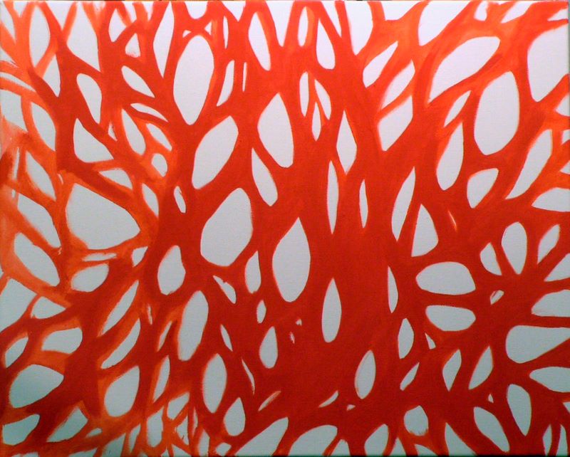
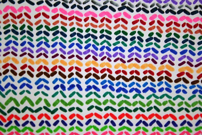
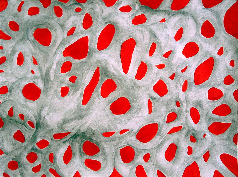
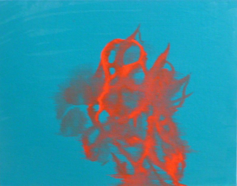
16"x20" oil on canvas - in progress
Started this piece, very similar to many others. The red is pure cadmium scarlet and really quite vibrant in person. This evening I went back and made the red solid and consistent. I was thinking of using a light greenish blue in the white areas, but I don't want this to be standard two-tone.
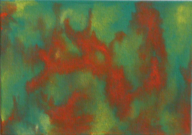
5"x7" oil on canvas board
I did this little study to play around with paint which was more mineral spirits than anything else. Cadmium lemon & cadmium scarlet. I wanted to approximate some of the forms and feeling of my water-based work.
9"x12" oil on canvas board - in progress
At the same time as above study, though this one is not as complete. I think this method has potential though I worried about the instability as a paint layer. I'll probably work this one up more.
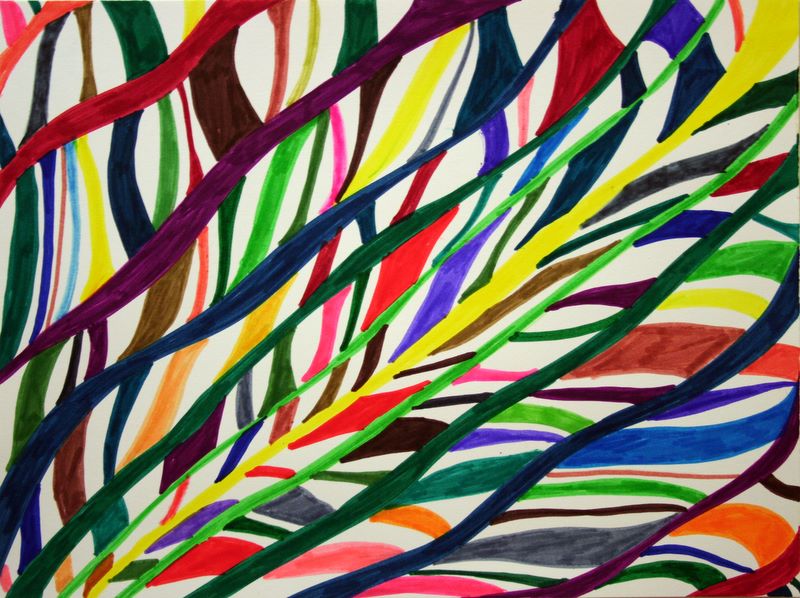
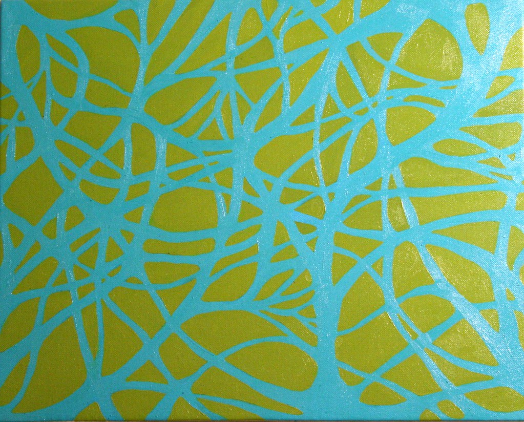
I really like red and turquoise / teal in contrast.
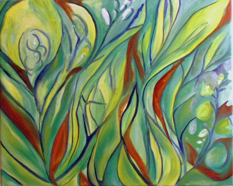
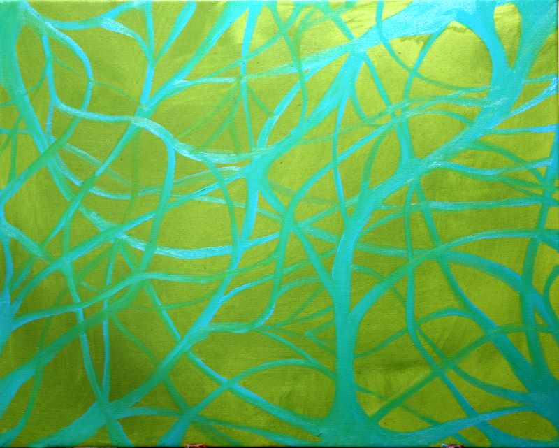
16"x20" oil on canvas - in progress
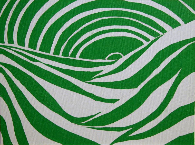
This was my little Impressionist moment. I've been checking out a lot of Arthur Dove lately and I got fed up with everything else I'd been doing, so I just indulged myself in some pleasant greens and illustrative natural forms. I like the way the blue line functions in this, and I will probably work on it when I miss painting flowers and the like. It put me in a spectacular mood, which gave me the courage to tackle the silk project that I set up for myself.
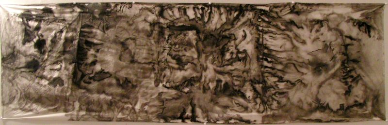
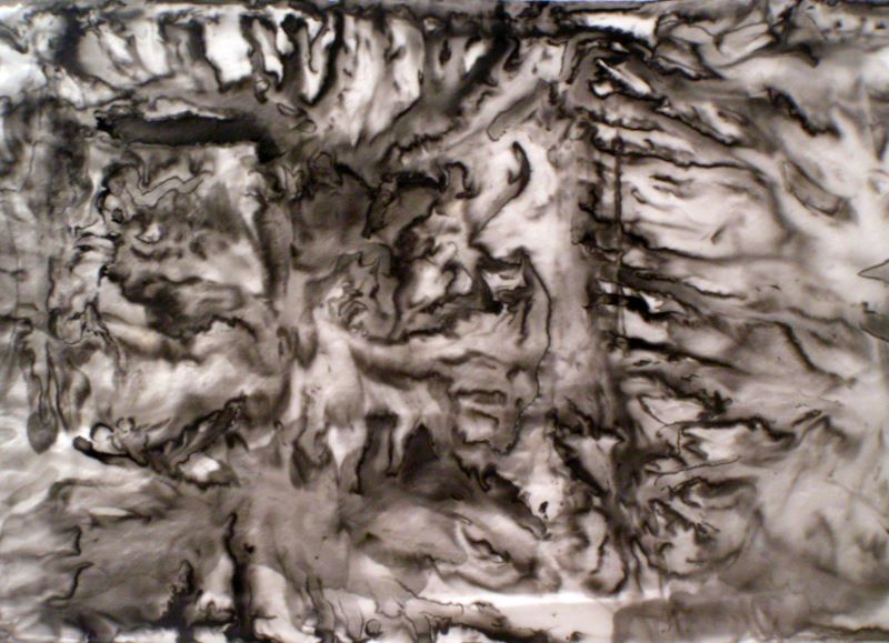
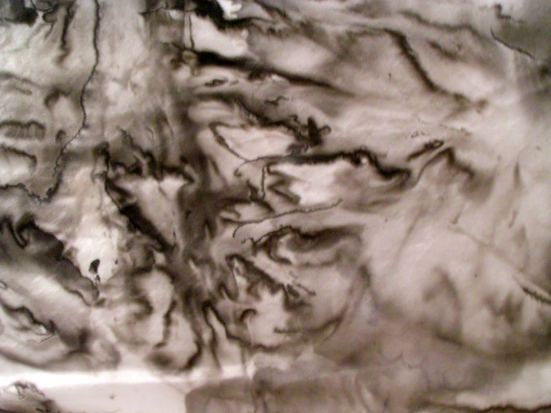
22"x72" ink on silk, with 2 detail views
I spent quite a lot of time working on this piece, as it was a brand-new method for me. In addition to playing around with it aesthetically, it was quite a challenge to get the right studio set-up to keep from spilling ink all over the floor or have the silk stick to the table and such. I really enjoyed this process but I have mixed feelings about the (possibly) completed piece. I want to think about it and work with this technique more.
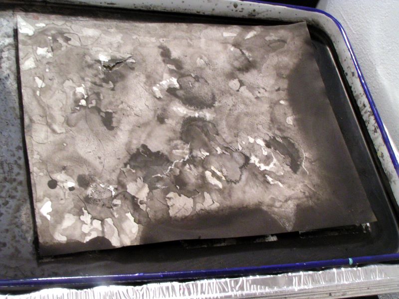
9"x12" ink on paper - in butcher's tray
Done without thinking while I was working on the first silk piece. I left it in the tray and it adhered to the bottom - tore it when I was pulling it up. So careless.
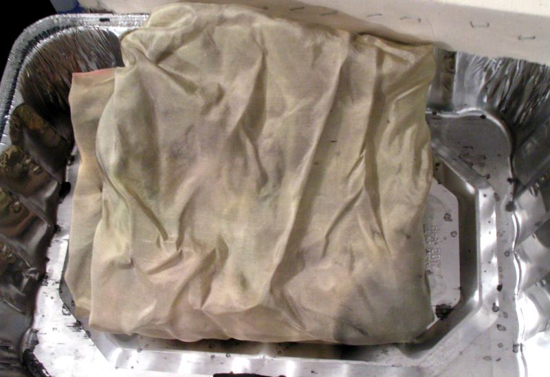
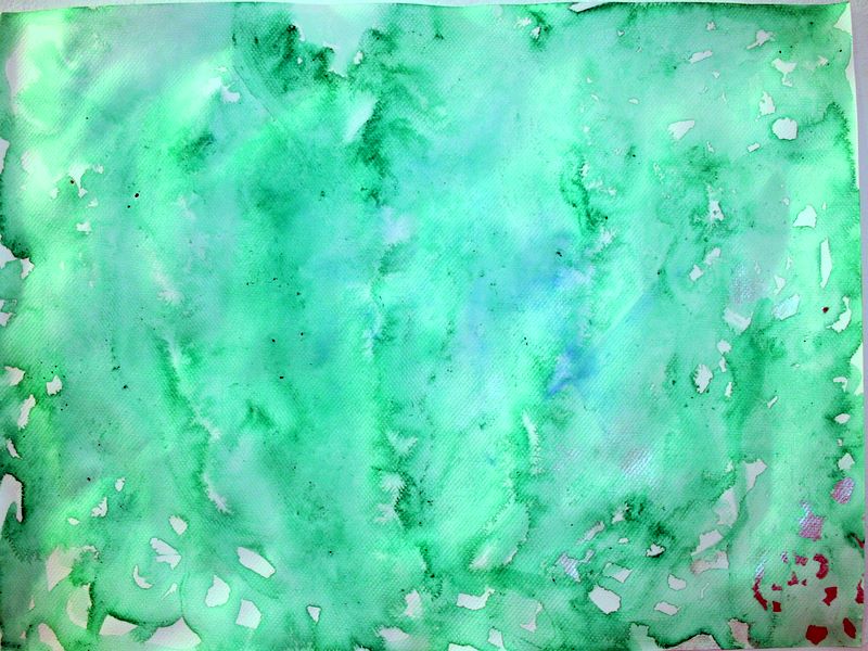
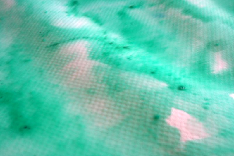
silk paints and ink on silk - in progress
Even though this is a studio blog, I just couldn't bring myself to photograph what this actually looks like right now. I spent a really long time screwing around with watered-down magenta silk-paint and dried pieces of yellow, making subtle washes which I later obliterated with sumi ink. The silk is larger (maybe 36"x72"?) and I had previously tinted it a greenish yellow color. With the gray of the ink washes and the sickly psychedelic tones from the silk paints, this is one sorry state of affairs at the moment. Of course this means I am resolved to pull it together, somehow some way.
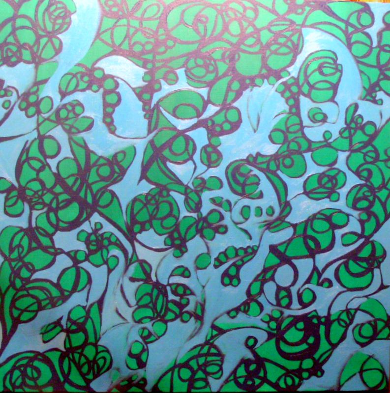
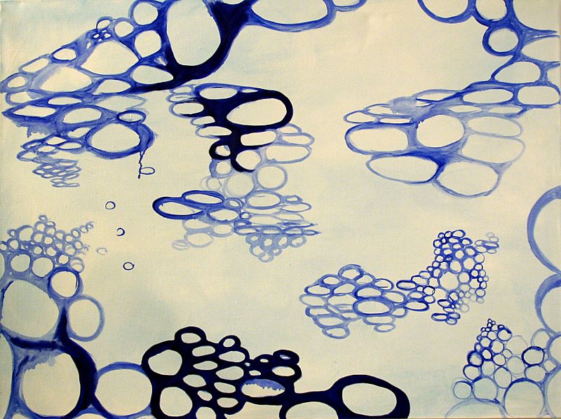
24"x24" oil on canvas - in progress
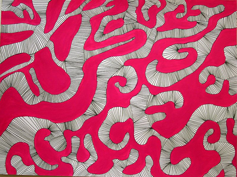
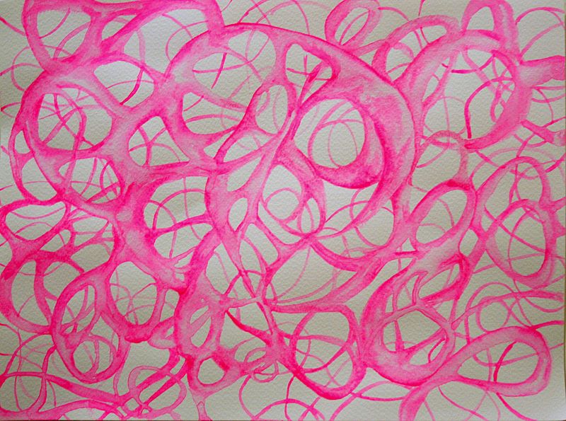
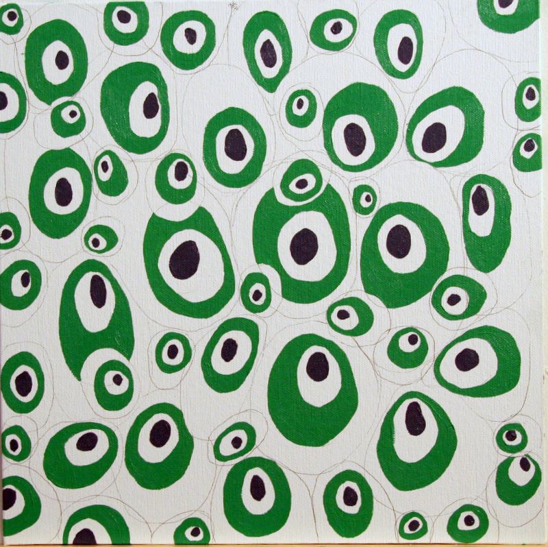
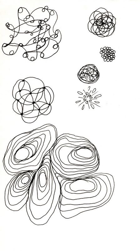
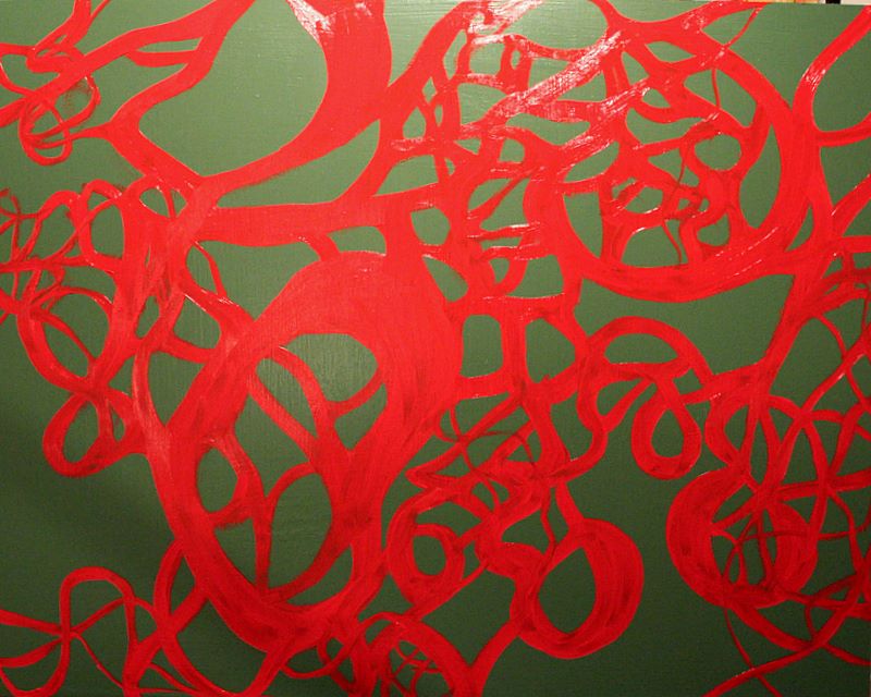
We had a guest lecturer in my thesis class today, and she gave critiques. Mine was more than a little negative, and she particularly took issue with this painting, which she dismissed as "merely a doodle." I wasn't terribly pleased with it myself, so I decided to map out solid forms and use the circles and curves as guidelines for new forms. I'll have a long way to go before this gets interesting.

24"x24" oil on canvas
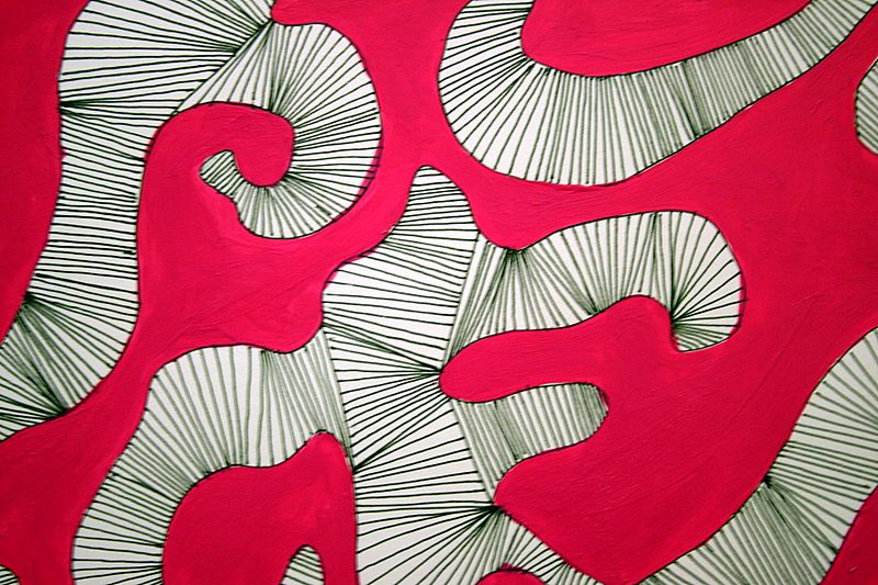
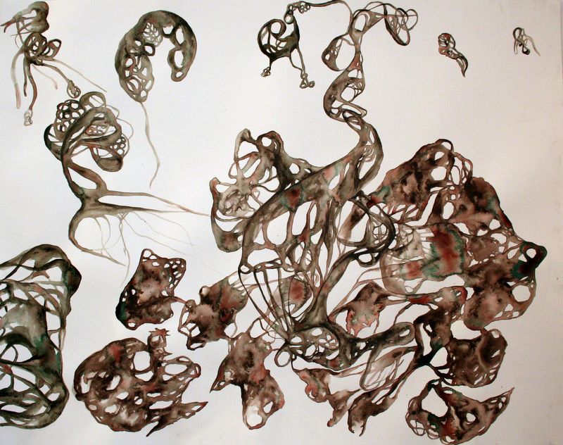
I started outlining a new painting, trying to vary the type and energy of my lines. There are suggestions of heartbeat rhythms and diagrams of the shape a bird's wings make, but nothing too interesting. This painting stayed in this state literally only an hour or so.
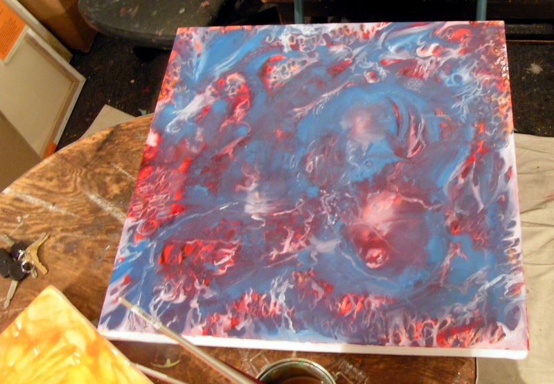
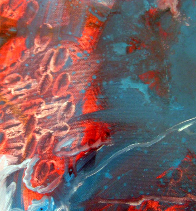
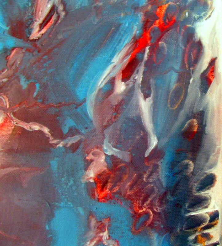
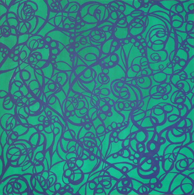
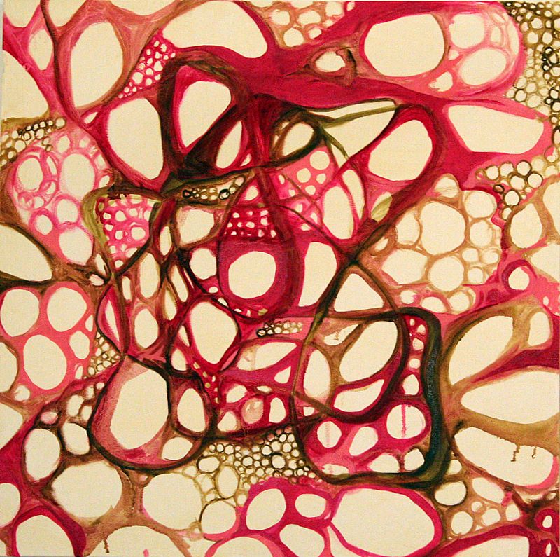
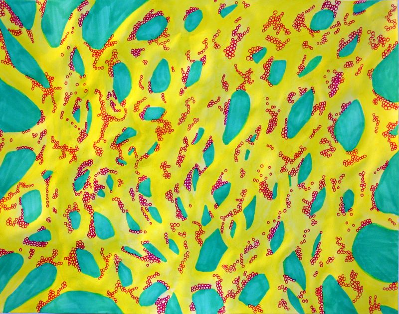
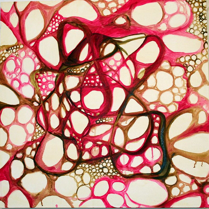
24"x24", oil on canvas - in progress, 2 detail views
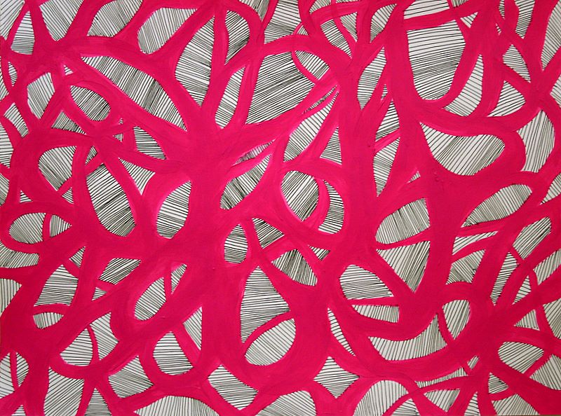
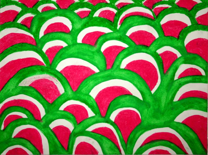
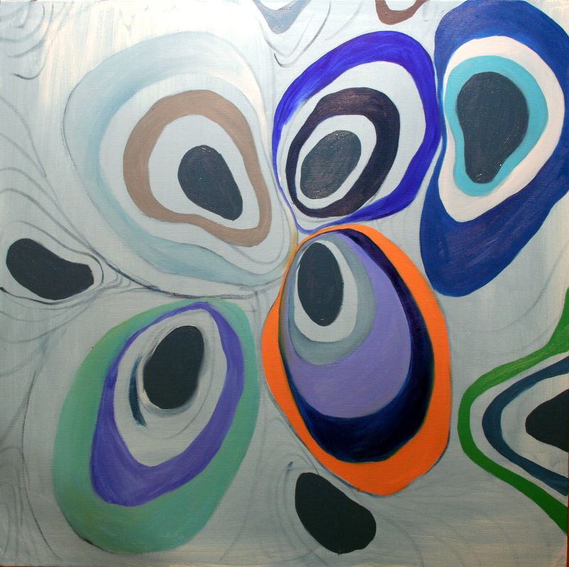
I took a good look around my studio and started feeling adventurous. Two of my professors had seriously railed against this painting, and I was stuck with it, so I slathered some juicy carmine crimson over it, followed by large swathes of blue. Because it was flat on my work table, it was a lot more effective to drip and spatter mineral spirits and thinned paint over the surface.
I really got into the shapes which were emerging and went in with some white to begin blocking out forms and ideas. The detail views remind me of bacteria, and I had this whole micro/macro sensation of both an interior immune system war and a cosmic space war.
This is the way I started paintings before grad school, and I think it has a lot more potential. I felt unblocked finally, and I'm excited with all the potential I see in this.
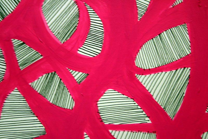
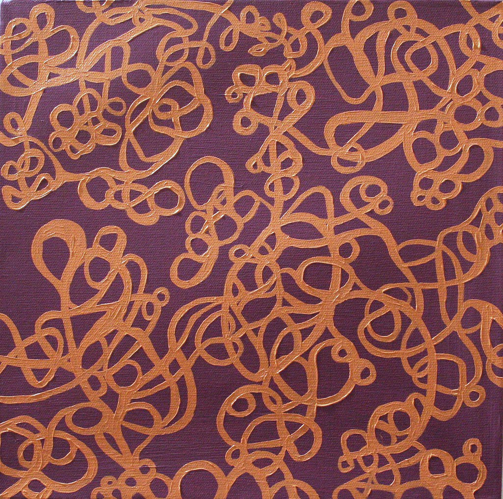
24"x24" oil on canvas - in progress
This is the same canvas just above the blue and purpley one, with the red lines. Emboldened by my mineral spirit fueled liberation, I went at this one with cadmium yellow and a lot of thinner. Again I think more interesting things are starting to happen than was originally going on with the red lines, so I'm also looking forward to carving this one out.
Whew. That was a long post. This gives me major incentive to stay more on top of this project! I'll start again tomorrow at day 39.